

Creating Material Icons with Long Shadows
tl;dr Icons with material design are cool. Here's how to create them using Inkscape.
Recently, I gave a short answer to a question about material design icons on the Graphic Design StackExchange forum. I thought it would be worthwhile to show how to make these icons in a tutorial-style blog post, too, so here it goes.

Material Design Icons
If you have spent at least one minute browsing through your favorite app store within the past two years, you have definitely seen material design icons. The term Material Design was coined by Google and describes the homonymous visual language that is used - most prominently - by the Android operating system. Because of their clean and attractive appearance, material design UI elements have spread and been ported to other platforms, for example the web (e.g. using React or Angular) and even to some iOS apps.
Material design features several characteristic styles and effects, most notably
- a flat overall appearance, no gloss whatsoever
- directional shadows, derived from elevated shapes and few light sources,
- shapes that are bent or folded, like paper
- strong, saturated primary colors
- animated ripple fills triggered by click/touch interaction
- etc.
The element that has become most ubiquitous, though, are flat app icons with long directional shadows. They are used widely across different platforms and app genres.
1. Create the Basic Shape
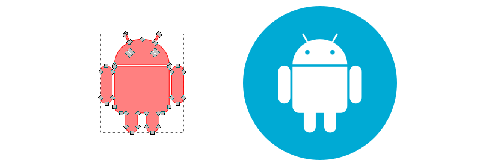
For the fun of it, let’s take the official Android mascot and produce a material design icon using Inkscape, a free and open source program for creating vector graphics. If you haven’t installed Inkscape yet, go ahead and do so (and then briefly familiarize yourself with the basics of drawing and editing shapes).
We start with the basic vector shape of the robot and a circular background, which you can either quickly draw using (and combining) rounded rectangles and circles or simply download here.
2. Create the Basic Shadow
This is where it starts to get fun. Use the Straight Line tool (Shift + F6) to draw the shadow shape. Think about
a directional key light that emits parallel rays from the northwest to the southeast. The light will touch every
northwest extremum point of the base shape and cast 45° shadows that point southeast. To achieve an exact rendering
of these 45° boundary lines, proceed as follows:
- Start with an approximate outline that has the right number of vertices.
- Since it is hard to know where exactly the vertex of a shadow edge must be placed on the base shape, simply place these vertices roughly where they need to be.
- However, while the vertices may still be slightly out of place, make sure that all the 45° line segments already
have the correct angle by pressing
Ctrlwhen drawing each of these segments.
You should end up with a closed shape that has the correct number of vertices and perfect 45° line segments that are still slightly misplaced:
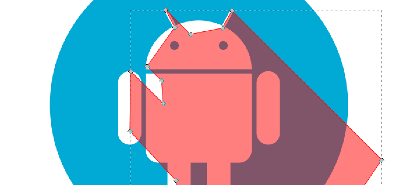
Note: The shadow shape should overlap the background circle on the southeast side.
3. Fine-tune the Shadow
Now let’s move the 45° line segments to their exact position. To do this, enter Edit Mode (either double-click the
shadow shape or select it and press F2).
- Select the start and end vertex of each 45° line segment (
Shift + Clickthem). - Zoom in and drag the northeast vertex of the selected vertex pair onto the edge of the base shape until the shadow line segment is a perfect tangent (and does not overlap the base shape).
- To facilitate this process, enable all vertex snapping buttons on the right side. This will magnetically snap the vertex that you’re currently moving to the base shape below.
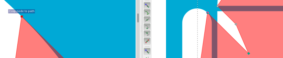
Note: When repeating this process for each relevant line segment, always double-check that you have selected both vertices of the line segment (not more, not less). This will ensure that you keep the 45° angle.
4. Clip the Shadow
The shadow outline now has the exact required geometry but is still overlapping the background shape. To clip it:
- Duplicate the background circle (select it, then press
Ctrl + D). - Select the duplicated circle in the foreground and the shadow shape (
Shift + Clickon the southeast portion that is visible). - Choose Path > Intersection from the menu or press
Ctrl + *to intersect both shapes.

5. Finishing Move
Press Down, Back, Down, Forward, High Kick, Low Kick on the keyboard.
Just kidding. To finish the icon
- Select the shadow shape, choose a pure black fill (
#000000) and give it an opacity of30. - Lower the shadow shape below the base shape by pressing
Page Down.
That’s it. You should end up with nice, flat Android icon with long shadows like the one shown at the top. Now, to practice, go ahead and model the Apple icon ;-).